A New Look (yes...again!)
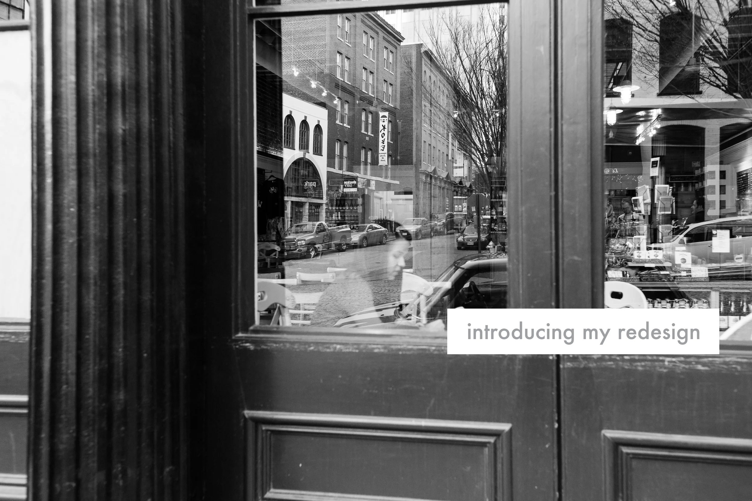
photo by my sweet friend Ashley Herrinton of Herrinton Weddings
If you've been visiting this site for any length of time, you've probably seen it undergo some visual changes. By some, I really mean quite a lot.
I'm never 100% satisfied with the look and feel of this site and my blog, and I'm constantly tweaking templates and making my own changes. I have this list of things in my mind that I want my site to be and have and do, and I finally decided it would be good to write them down.
- I want my site to be clean, have lots of white space and be simple, calming and aesthetically pleasing.
- I want navigation to be clear, easy and unobtrusive.
- I want my personality to shine through each page, whether through words or images, and for people who visit here to leave feeling like they know the real Rachel, and that they've seen Jesus through that as well. I never want the glory to come back to me, but to Him alone.
- I want my site to be easily adaptable to new things, whether that be a new page hosting posts about adventures I've had recently (RADventures is too good to pass up on, don't you think?!) or a shop someday (stay tuned...). I want it to be flexible and to grow as I do.
- I want to create all content on my site, from photos to graphics to blog posts (with the exception of posts from guest bloggers!), so it's as true to me as it can be.
o, with all of this in mind, I spent my weekend browsing around and brainstorming and working on what I feel is a cohesive, authentic design for my site. I would love to get your feedback and hear what you think of all the new changes! I'm sure it will continue to evolve over time, but for now, this feels right. It's a blessing to have a tiny corner of the Internet to call mine, and I hope that you are encouraged by it every time you visit. I love having you here!

